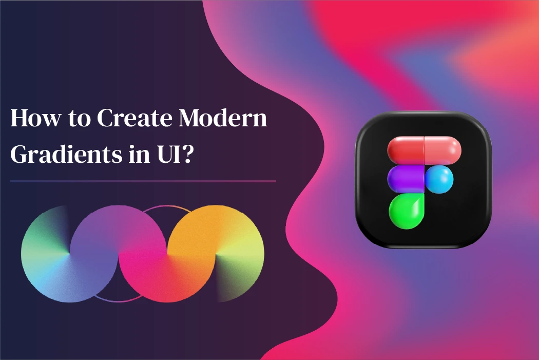
How to Create Modern Gradients in UI (Best Tips + Examples)
Gradients are back—but not the shiny, “2008-button” kind. Today’s gradients feel soft, intentional, and modern. They’re used to add depth, direct attention, create emotion, and make interfaces feel premium. The best part? You don’t need to be a “visual genius” to design good gradients. You just need a simple method.
In this guide, you’ll learn how to create modern gradients in UI step by step, plus practical tips, color formulas, and real-world use cases.
What Makes a Gradient “Modern”?
A modern UI gradient usually has these traits:
- Subtle transitions (no harsh bands)
- Controlled contrast (pleasant, not overpowering)
- Purpose-driven placement (not sprinkled everywhere)
- Softer colors (often slightly desaturated)
- Natural lighting feel (like real light and shadow)
Modern gradients are less about decoration and more about visual hierarchy and brand personality.
Step 1: Pick a Clear Purpose First
Before picking colors, decide why the gradient exists. Modern gradients work best when they have a job, such as:
- Highlighting a primary CTA button
- Creating depth in a hero section
- Adding softness to a background
- Distinguishing sections without heavy borders
- Making cards and panels feel layered
If a gradient doesn’t improve clarity or focus, it becomes noise.
Step 2: Choose a “Base Color” and Build Around It
Instead of randomly selecting two different bright colors, start with one base color and create variations.
A simple rule:
- Pick one main hue (like blue)
- Create a second color by shifting:
- Brightness (lighter/darker)
- Saturation (more muted/less muted)
- Hue slightly (5–25 degrees)
- Brightness (lighter/darker)
This prevents the gradient from looking “rainbow-like” and makes it feel designed.
Easy combinations that look modern
- Blue → Purple
- Pink → Orange
- Teal → Blue
- Purple → Magenta
- Indigo → Cyan
Step 3: Use 3 Color Stops (Not Just 2)
Two-color gradients often look basic. A modern trick is adding a middle stop.
Example (Blue → Purple):
- Start: #2563EB
- Middle: #6D28D9
- End: #DB2777
That middle color makes the transition smoother and richer.
Why it works
Real light and materials rarely transition in a perfectly straight line. A third stop adds realism and depth.
Step 4: Try “Soft Contrast” Instead of Extreme Contrast
Modern gradients usually avoid:
- Neon on neon
- Pure black to pure color
- Very harsh contrast jumps
Instead, aim for:
- 10–25% brightness difference
- slightly reduced saturation
- one color as the anchor
If you want bold gradients, keep them bold in a small area (like a button or badge), not across the entire screen.
Step 5: Pick the Right Gradient Style for UI
Not all gradients fit every UI element. Use the right type based on the purpose:
1) Linear gradients (best for buttons + headers)
Clean, modern, easy to control.
Use for:
- Buttons
- Top bars
- Section backgrounds
2) Radial gradients (best for hero sections)
Radial gradients feel like a light source behind the content.
Use for:
- Landing page hero background
- Spotlight on important content
3) Mesh or multi-point gradients (best for premium branding)
These are modern and “Apple-like”, but can get messy quickly.
Use for:
- Background art
- Brand identity sections
- Login screens
If you’re building a dashboard or productivity app, keep it simple: linear + soft radial is often enough.
Step 6: Use “Gradient + Noise” to Look Premium
This is a pro-level trick used in many modern UIs: add a very subtle noise texture on top of a gradient background. It reduces banding and gives a more natural finish.
How to do it:
- Add a grain/noise layer at 2%–6% opacity
- Use a tiny noise texture image
- Keep it extremely subtle
The result feels more “real” and less digitally flat.
Step 7: Keep Accessibility in Mind
Gradients can easily harm readability if text sits on top.
Use these cheques:
- Ensure text has strong contrast with the lightest part of the gradient
- Add an overlay (like a black/white layer at 10–25% opacity) behind text
- Use a solid color card behind paragraphs if needed
Best practice:
- Use gradients for backgrounds
- Use solid colors for text containers
- Reserve high-contrast gradients for small UI elements
Step 8: Use Gradients to Guide Attention
Gradients can direct the user’s eye, like visual arrows.
Smart placements:
- Brightest area behind your headline or CTA
- Soft fade at the top to frame navigation
- Gentle gradient on cards to show “active” or “selected”
- Background gradients to separate sections without borders
A gradient should help users understand “what matters” on the screen.
Step 9: Test Your Gradient in Real UI Conditions
A gradient can look perfect in a colors picker and still fail in real UI.
Test it on:
- Light mode and dark mode
- Mobile and desktop
- Low-brightness screens
- Older displays (banding is common)
- With real text (not placeholder)
Also, check how it looks beside your brand colors and icons.
Modern Gradient Formulas You Can Copy
Here are a few safe, modern gradient directions:
Clean Blue → Purple (modern SaaS style)
- #1D4ED8 → #7C3AED → #EC4899
Soft Teal → Blue (fresh + calm)
- #14B8A6 → #0EA5E9 → #1D4ED8
Warm Sunset (great for creative apps)
- #F97316 → #EC4899 → #8B5CF6
Dark Premium (for dark UI)
- #0B1220 → #111827 → #1F2937
(then add a radial glow like #60A5FA at low opacity.)
Common Gradient Mistakes to Avoid
Avoid these if you want a modern UI:
- Using too many gradients everywhere
- Picking two random bright colors without harmony
- Putting text directly on a high-contrast gradient
- Overusing neon saturation
- Making gradients too sharp (hard transitions)
- Using gradients where a simple solid color is clearer
Modern design is about restraint. One great gradient is better than five average ones.
Final Thoughts: Modern Gradients Are About Balance
Learning Modern gradients can make your UI feel elegant, dimensional, and memorable — when they’re used intentionally. The key is to keep transitions smooth, contrast controlled, and placement purposeful.